2024-07-12
한어Русский языкEnglishFrançaisIndonesianSanskrit日本語DeutschPortuguêsΕλληνικάespañolItalianoSuomalainenLatina
Heatmaps are an effective way to display matrix data through color mapping.imshowThe function is a powerful tool for creating various heat maps. Before starting the example, let's take a look at the main parameters:
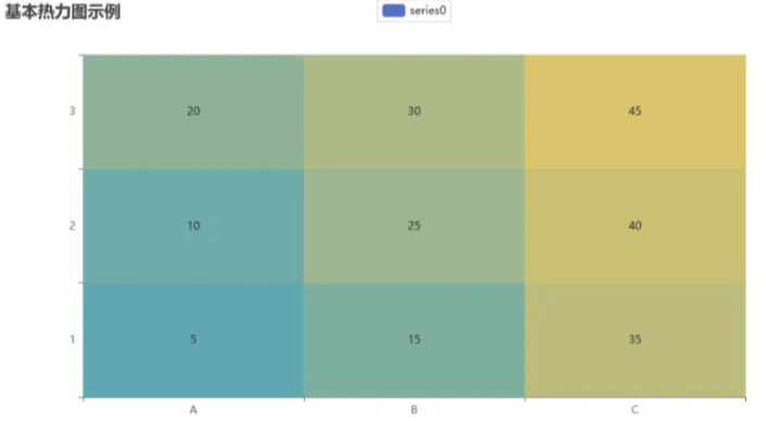
First, let's draw a basic heat map to show the overall distribution of the dataset:
- import matplotlib.pyplot as plt
- import numpy as np
-
- data = np.random.random((10, 10)) # 生成随机矩阵数据
-
- plt.imshow(data, cmap='viridis', interpolation='nearest')
- plt.colorbar()
-
- plt.title('基本热力图')
- plt.show()
In this simple example, we usedviridisColormaps andnearestInterpolation method.
Matplotlib supports a variety of built-in color mappings, but we can also customize color mappings to make the heat map more personalized. The following is an example of a custom color mapping:
- custom_cmap = plt.cm.get_cmap('coolwarm', 5) # 从'coolwarm'中选择5个颜色
-
- plt.imshow(data, cmap=custom_cmap, interpolation='bilinear')
- plt.colorbar()
-
- plt.title('自定义颜色映射')
- plt.show()
Adding annotations to heatmaps can more clearly convey the meaning of the data. We can useannotateThe function labels the values on the heat map:
- fig, ax = plt.subplots()
- im = ax.imshow(data, cmap='plasma', interpolation='bicubic')
-
- for i in range(len(data)):
- for j in range(len(data[i])):
- text = ax.text(j, i, f'{data[i, j]:.2f}', ha='center', va='center', color='w')
-
- plt.colorbar(im)
-
- plt.title('带有注释的热力图')
- plt.show()
Matplotlib also supports drawing heatmaps of different shapes, such as circular or elliptical points. Here is an example:
- from matplotlib.patches import Ellipse
-
- fig, ax = plt.subplots()
- im = ax.imshow(data, cmap='YlGnBu', interpolation='bicubic')
-
- # 添加椭圆形状的点
- for i in range(len(data)):
- for j in range(len(data[i])):
- ellipse = Ellipse((j, i), 0.8, 0.8, edgecolor='w', facecolor='none')
- ax.add_patch(ellipse)
-
- plt.colorbar(im)
-
- plt.title('不同形状的热力图')
- plt.show()
Sometimes, we want to highlight certain blocks in the matrix to make the key information more prominent. We can do this by usingimshowofextentParameters to achieve this:
- fig, ax = plt.subplots()
- block_data = np.random.random((5, 5)) # 生成块状数据
-
- ax.imshow(block_data, cmap='Reds', interpolation='nearest', extent=[2, 7, 2, 7])
- plt.colorbar()
-
- plt.title('分块热力图')
- plt.show()
In some cases, we may need to display multiple heatmaps in the same figure to compare or present different aspects of the data. This can be done with Matplotlib'ssubplotaccomplish:
- fig, axs = plt.subplots(1, 2, figsize=(10, 4)) # 一行两列的子图
-
- # 第一个子图
- axs[0].imshow(data, cmap='Blues', interpolation='nearest')
- axs[0].set_title('子图1')
-
- # 第二个子图
- axs[1].imshow(data.T, cmap='Oranges', interpolation='bicubic') # 转置数据以展示不同热力图
- axs[1].set_title('子图2')
-
- plt.show()
Matplotlib also supports drawing 3D heatmaps, which are very useful for displaying data with three-dimensional structure:
- from mpl_toolkits.mplot3d import Axes3D
-
- fig = plt.figure(figsize=(8, 6))
- ax = fig.add_subplot(111, projection='3d')
-
- x, y = np.meshgrid(range(len(data)), range(len(data)))
- ax.plot_surface(x, y, data, cmap='viridis')
-
- ax.set_title('3D热力图')
- plt.show()
Matplotlib allows you to further explore advanced settings for color mapping and colorbars to meet more complex needs. Here is an example that demonstrates customizing the colorbar and adding colorbar labels:
- fig, ax = plt.subplots()
- im = ax.imshow(data, cmap='coolwarm', interpolation='nearest')
-
- # 自定义颜色栏
- cbar = plt.colorbar(im, ax=ax, fraction=0.046, pad=0.04)
- cbar.set_label('数据值', rotation=270, labelpad=15)
-
- plt.title('高级颜色栏设置')
- plt.show()
Sometimes, we want to show the changes of data in a dynamic way, which can be done by using MatplotlibFuncAnimationThe following is a simple dynamic heat map example:
- from matplotlib.animation import FuncAnimation
-
- fig, ax = plt.subplots()
- data_frames = [np.random.random((10, 10)) for _ in range(10)] # 生成多帧数据
-
- def update(frame):
- ax.clear()
- im = ax.imshow(data_frames[frame], cmap='Blues', interpolation='nearest')
- plt.title(f'动态热力图 - 帧 {frame}')
-
- ani = FuncAnimation(fig, update, frames=len(data_frames), interval=500, repeat=False)
- plt.show()
To make the heatmap more interactive, you can use Matplotlib’simshowCombinationmplcursorsThe library implements the hover display of data points:
- import mplcursors
-
- fig, ax = plt.subplots()
- im = ax.imshow(data, cmap='Greens', interpolation='nearest')
-
- mplcursors.cursor(hover=True).connect("add", lambda sel: sel.annotation.set_text(f'{sel.artist.get_array()[sel.target.index]:.2f}'))
-
- plt.title('交互式热力图')
- plt.show()
In this way, when the mouse hovers over the data point of the heat map, the corresponding value will be displayed.
Sometimes, we may need to normalize the data range in order to more clearly show the differences in the data. This can be done byNormalizeClass to implement:
- from matplotlib.colors import Normalize
-
- normalized_data = Normalize()(data) # 将数据标准化
-
- fig, ax = plt.subplots()
- im = ax.imshow(normalized_data, cmap='YlGnBu', interpolation='bicubic')
- plt.colorbar(im, label='标准化值范围')
-
- plt.title('标准化热力图')
- plt.show()
Finally, we can export the drawn heat map as an image file through Matplotlib for further use or sharing:
- fig, ax = plt.subplots()
- im = ax.imshow(data, cmap='coolwarm', interpolation='nearest')
- plt.colorbar(im)
-
- plt.title('导出热力图')
- plt.savefig('heatmap.png')
The above is a series of examples and techniques for drawing different kinds of cool heat maps with Matplotlib. Through these examples, we have gained an in-depth understanding of the power of Matplotlib and how to create colorful, interactive and advanced heat maps by adjusting parameters and applying different techniques. I hope these examples provide useful guidance for your work in data visualization.
In this article, we explored the various techniques and parameter settings of the Matplotlib library when drawing different types of cool heat maps. Here are the key points we learned:
Basics:We have learned the basic parameters for drawing heat maps in Matplotlib, such asdata、cmap、interpolation、vminandvmax,These parameters have an important impact on the appearance and readability of the heat map.
Common heat map types:Through examples, we explored the drawing methods of common heat map types such as basic heat maps, custom color mapping, annotations, heat maps of different shapes, block heat maps, multi-submap heat maps, 3D heat maps, etc.
advanced settings:We learned how to perform advanced color mapping and color bar settings, as well as how to make heat maps more personalized and readable by adjusting color bar labels, dynamic display, interactivity, and normalizing data ranges.
Practical tips:We introduced some practical tips, such as adding a color bar, exporting heat maps as image files, and interactive display of heat maps, to improve the usability and shareability of charts.

I have devoted myself to the research of technology for more than 30 years. I am proficient in various languages such as Java, Linux, JavaScript, PHP, CSS, etc. I have made many contributions in the field of open source. I have established a developer documentation site to share some problems in technology development for everyone to read.