2024-07-12
한어Русский языкEnglishFrançaisIndonesianSanskrit日本語DeutschPortuguêsΕλληνικάespañolItalianoSuomalainenLatina
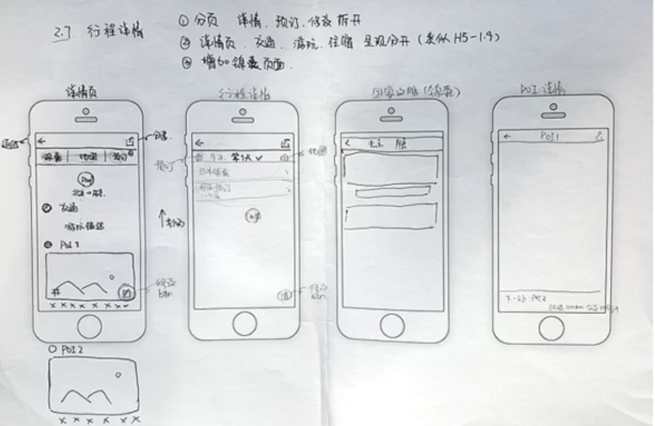
Hand-drawn drawings are used in the early stages of planning to organize ideas.
Simple interaction, no color matching required, mainly black, white and gray, used in product planning and review stages
Standardized low-fidelity prototypes are the basis for high-fidelity prototypes
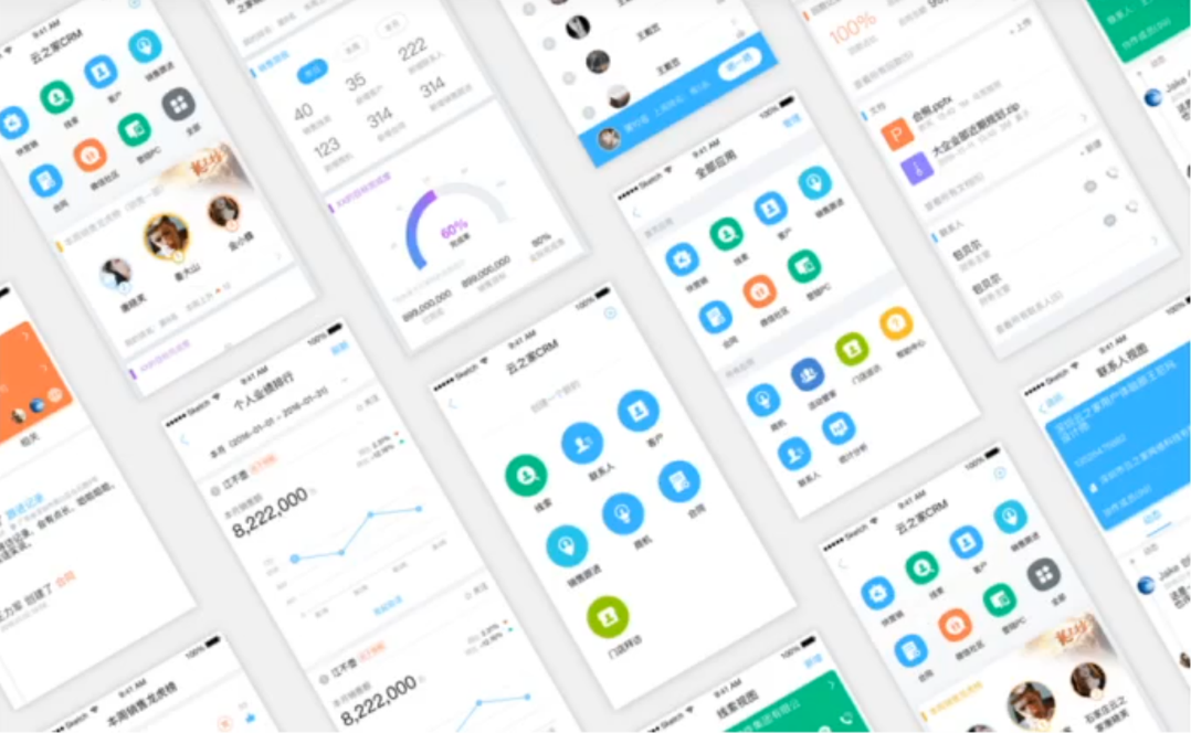
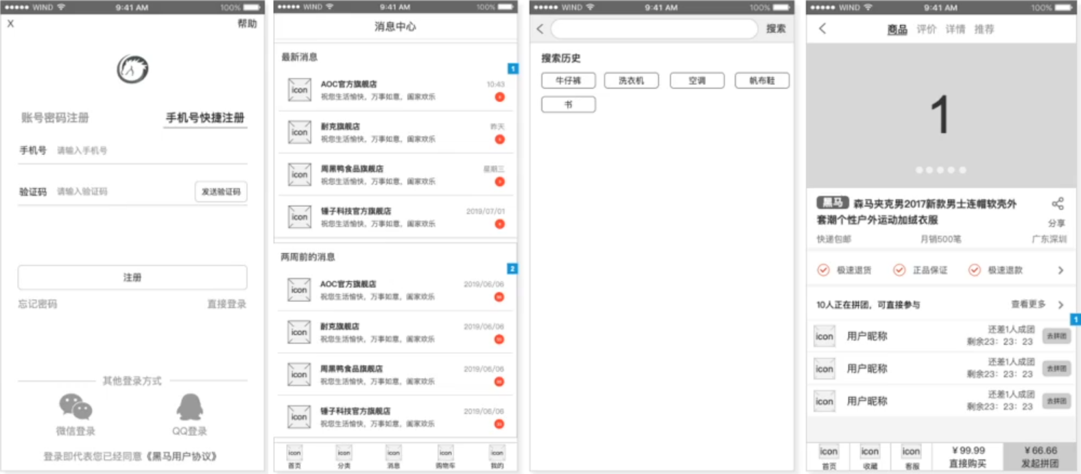
Complex interactions, generally used for public demonstrations,
The product first produces a low-fidelity prototype, and the designer produces a design draft based on the prototype
Low-fidelity prototype + design draft = high-fidelity prototype
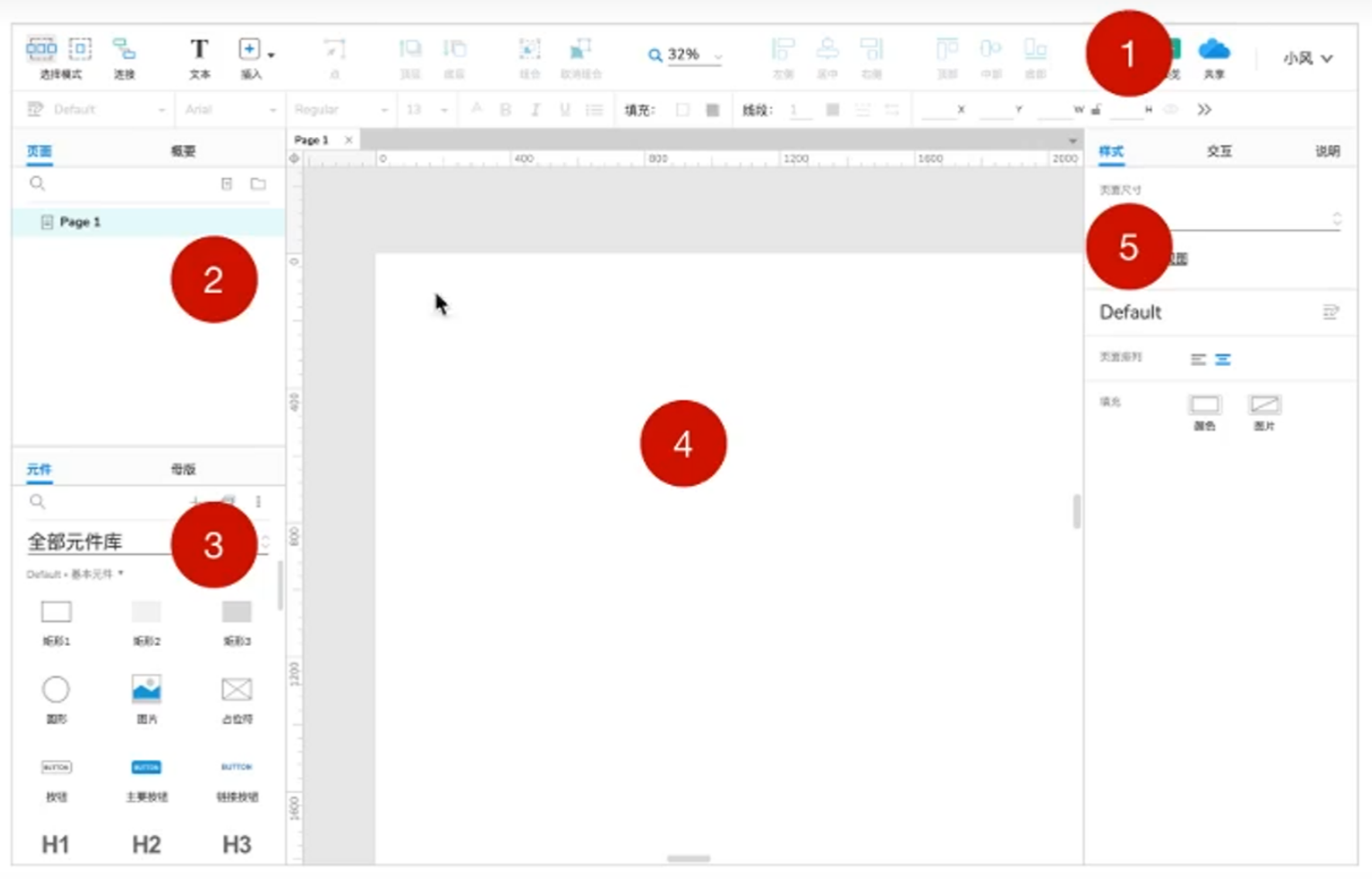
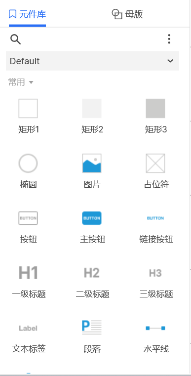
①Menu area ②Layer area ③Component area ④Drawing area ⑤Style area
Drag the component to the canvas and modify the style
Interaction is the process of interaction between humans and computers, and interaction design is the design of the rules and performance of interaction.
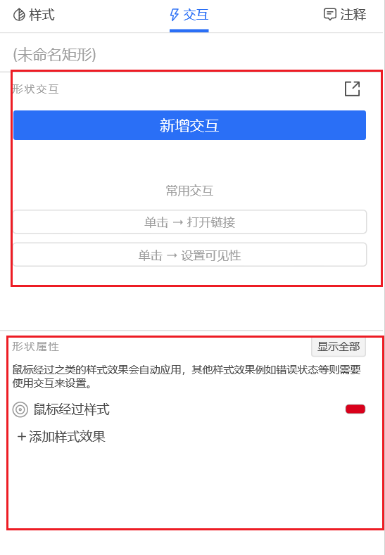
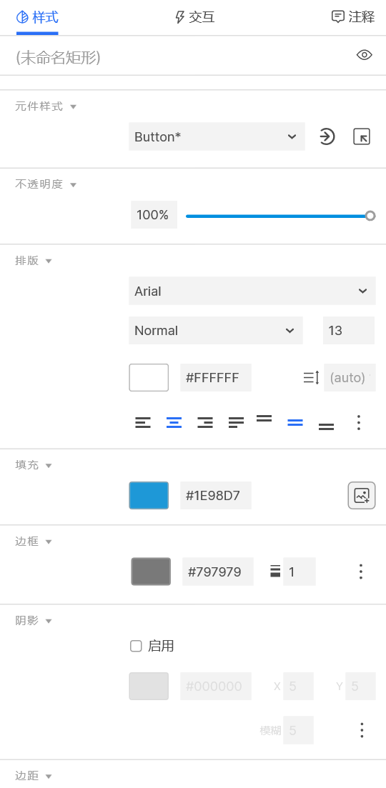
In Axure, interactions are divided into interaction styles and interaction logic.
1. The interactive style has built-in common style changes, which is easy to use but cannot set logic
2. The setting of interactive logic is more flexible. By adding events and actions to elements, personalized styles and logical interactions can be completed.
3. The set interactive effects need to be viewed in the preview
The role of the repeater is to achieve the reuse of the structure, without having to copy and paste all the time

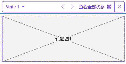
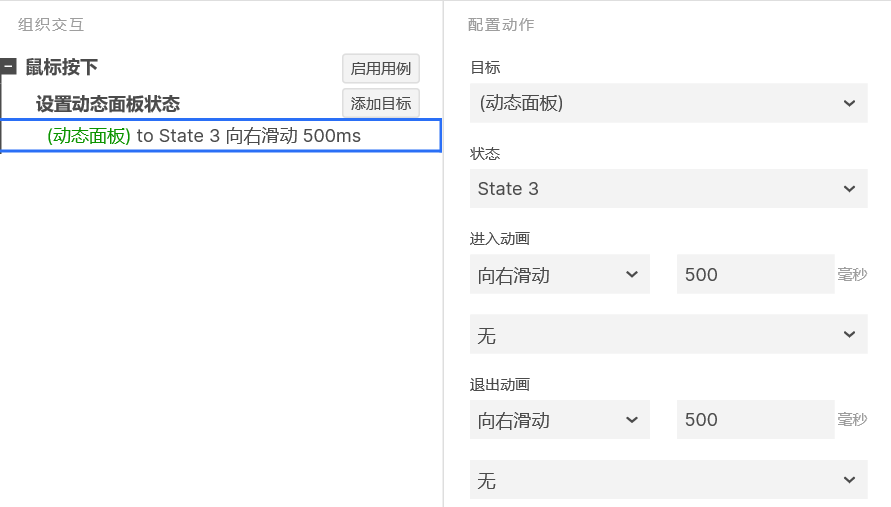
Using dynamic panels to achieve content switching effects

The difference between mobile and computer apps:
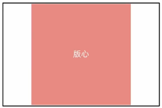
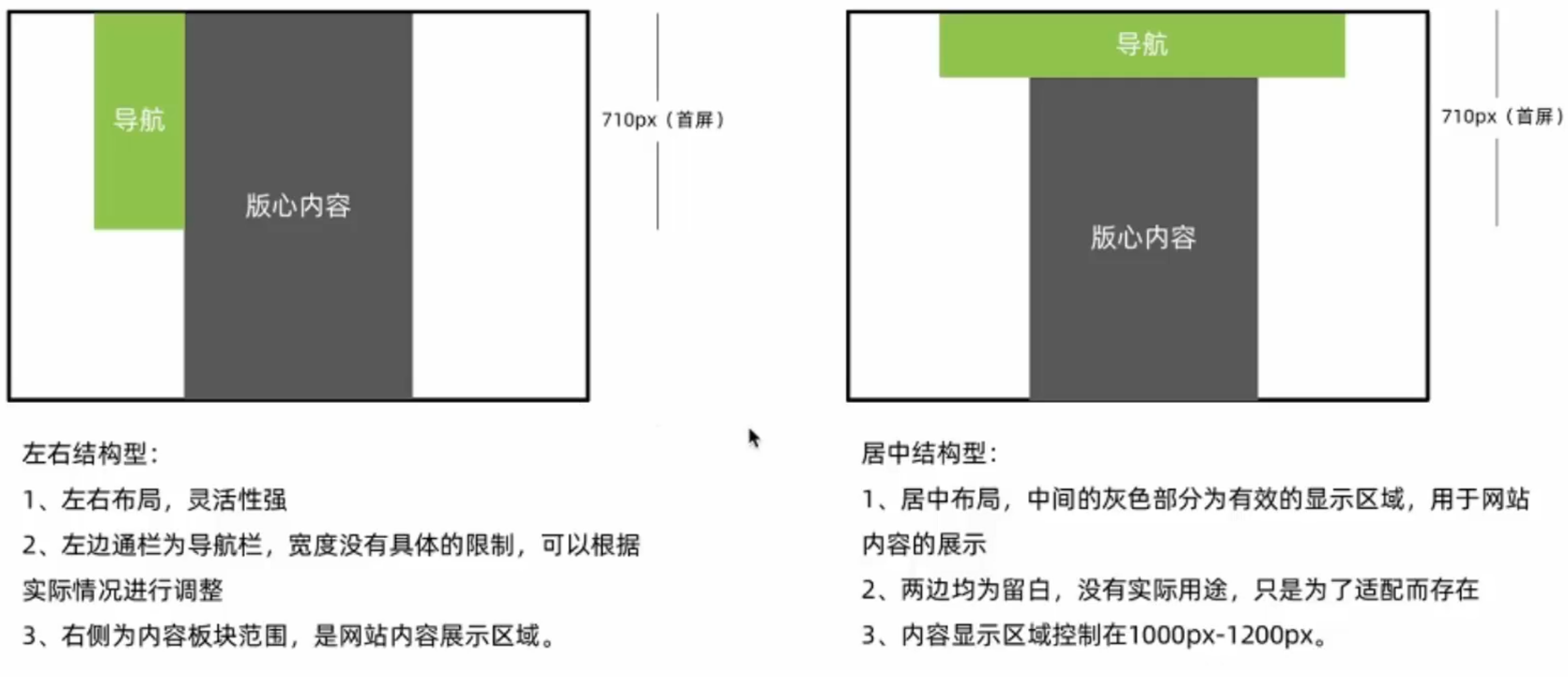
1. Page center
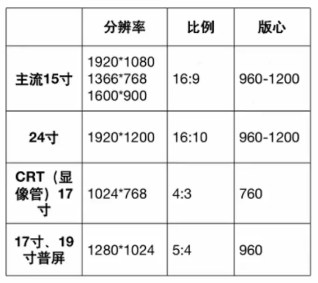
The current mainstream resolution is 1920 * 1080, so the page size is generally between 960-1200, and 1200 is generally recommended.
Before 2012, the mainstream resolution was 1024 * 768, so the page size was 760
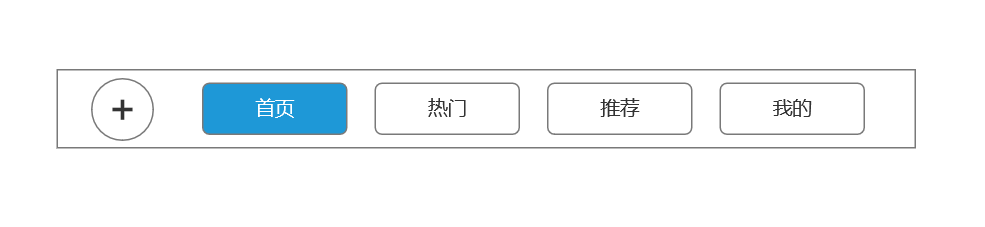
2. Navigation
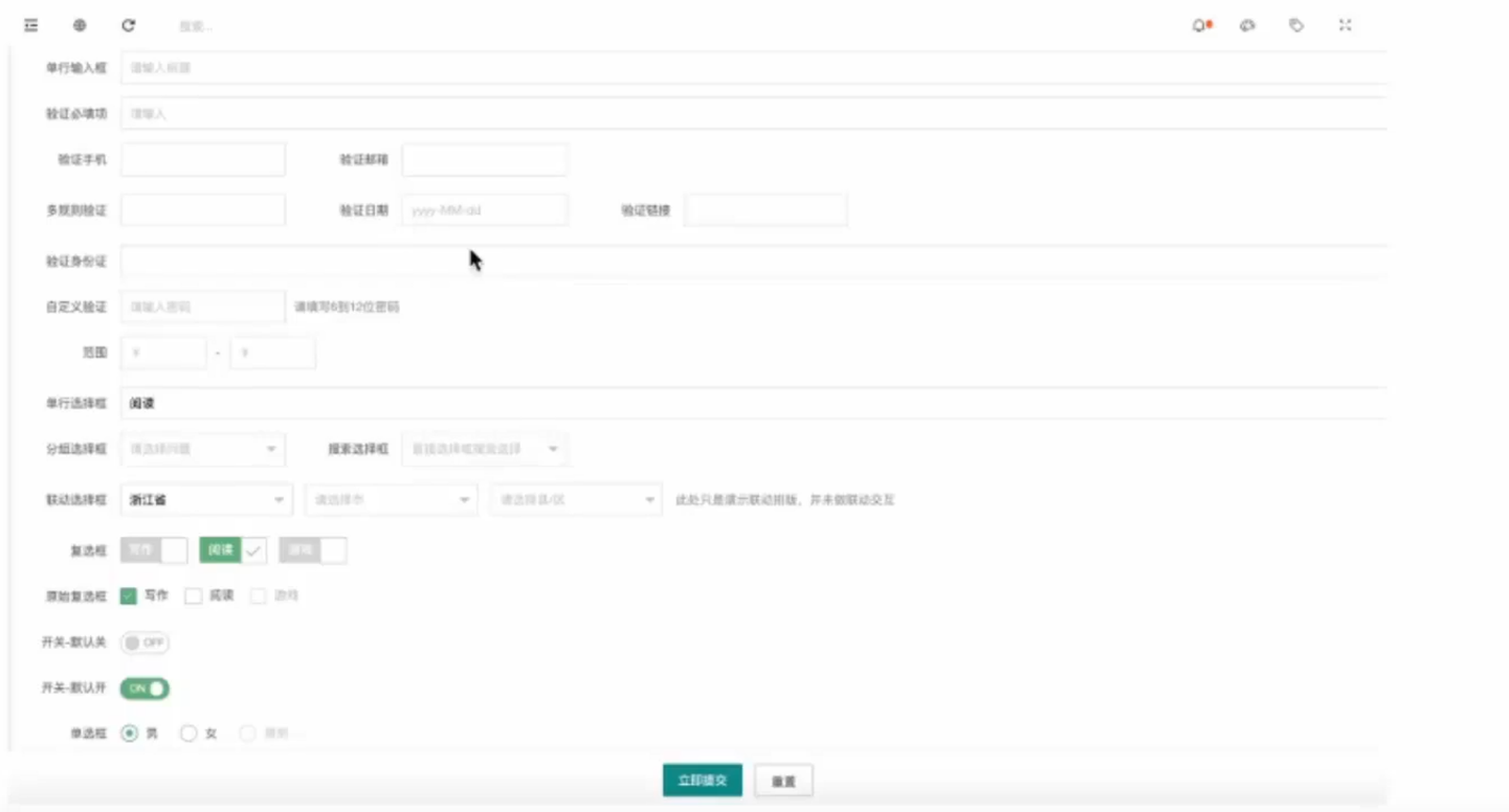
3. Form
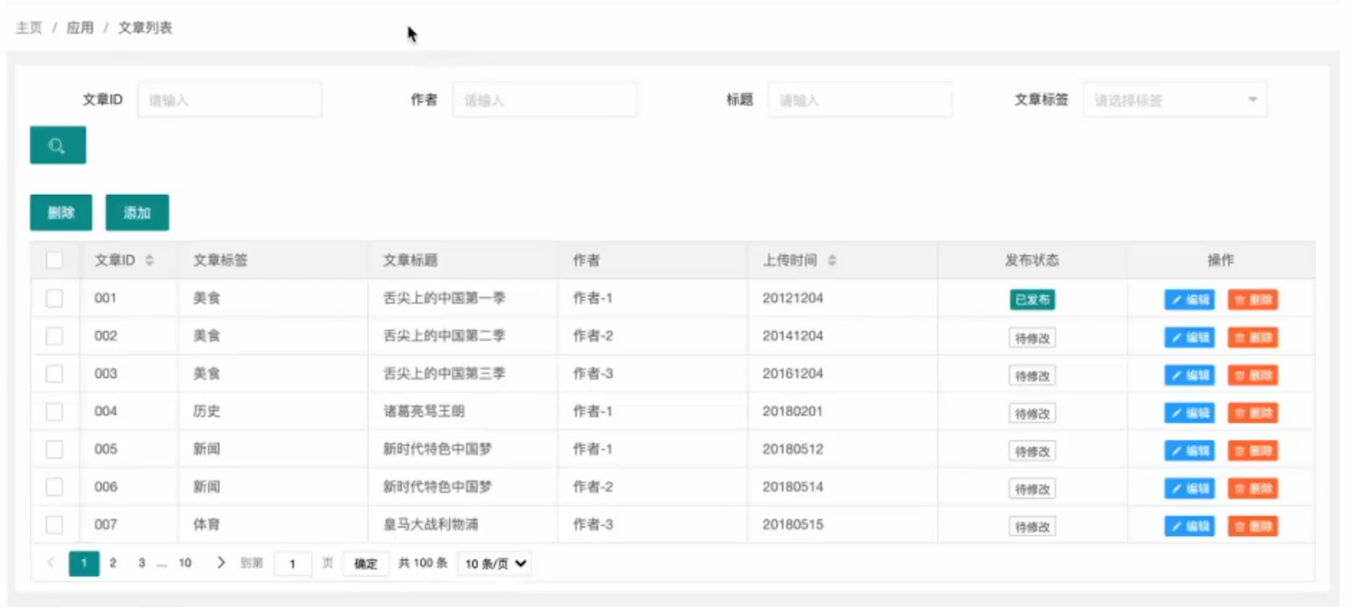
4. List
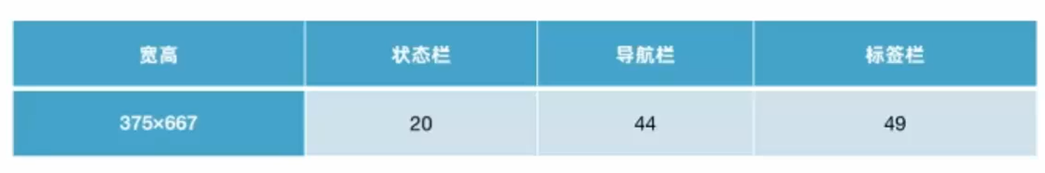
There is no fixed size specification for mobile terminals. Prototypes are made according to the size of the adapted model. For example, the size of iPhone 6 is 375 * 667
1. Fixed element size
2. Common areas
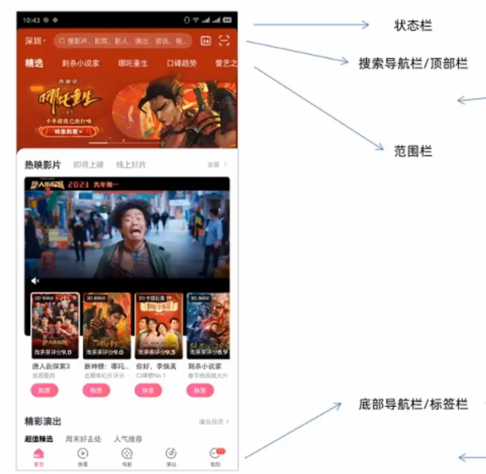
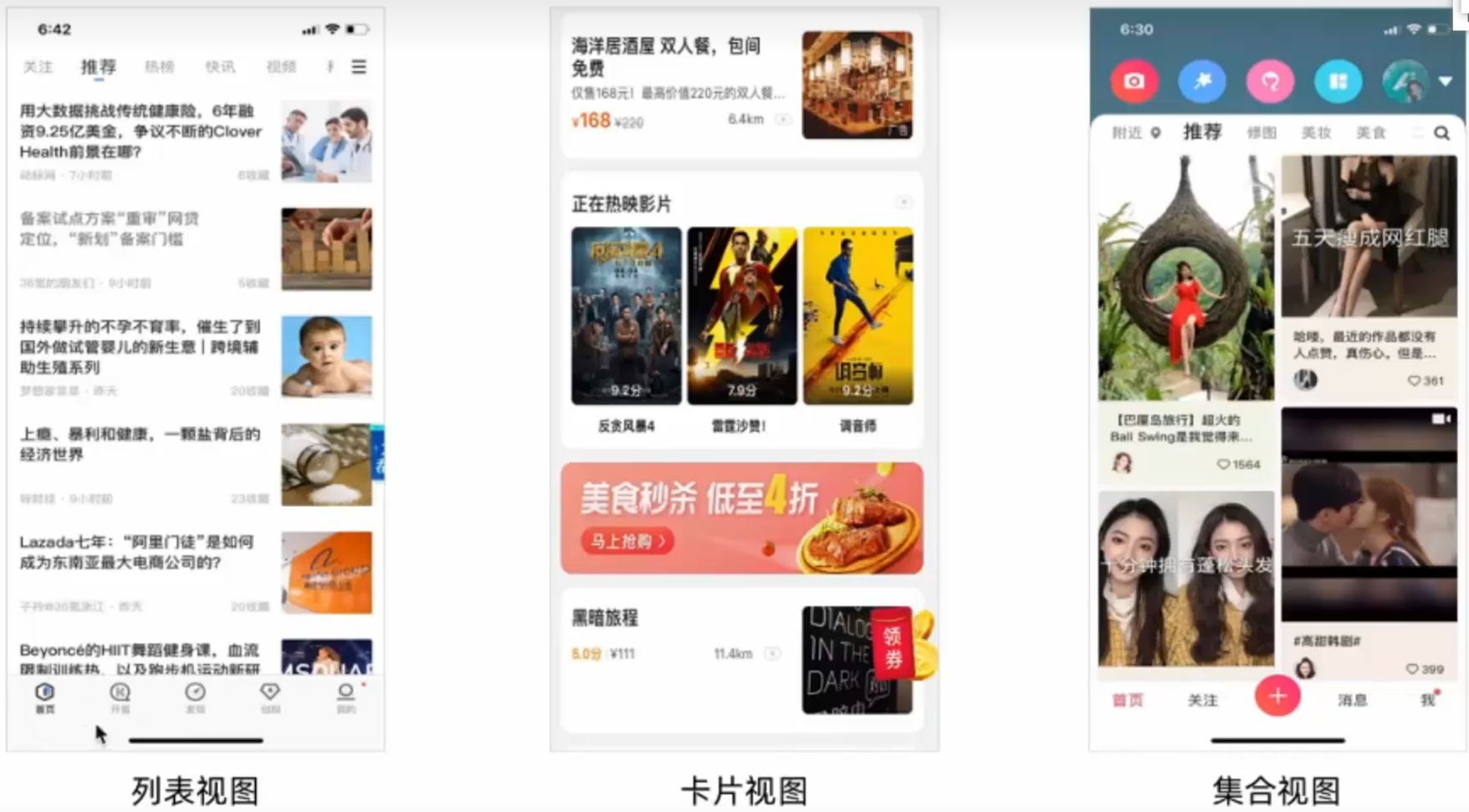
3. Common display forms

I have devoted myself to the research of technology for more than 30 years. I am proficient in various languages such as Java, Linux, JavaScript, PHP, CSS, etc. I have made many contributions in the field of open source. I have established a developer documentation site to share some problems in technology development for everyone to read.
