2024-07-12
한어Русский языкEnglishFrançaisIndonesianSanskrit日本語DeutschPortuguêsΕλληνικάespañolItalianoSuomalainenLatina
The GOplot package is used to visualize biological data. More specifically, the package integrates expression data with the results of functional analysis and visualizes them. However, please note thatThis package cannot be used to perform these analyses, only to visualize the results.In all scientific fields, it is difficult to describe things realistically due to space limitations and the required simplicity of results, so information needs to be visualized and conveyed using pictures. Well-designed graphics can provide more information in a smaller space. The idea of this package is to allow users to quickly examine large amounts of data, reveal trends in the data, and find patterns and correlations in the data.
Data visualization can help us find answers to biological questions, judge a hypothesis, and even find different angles to investigate different problems. The drawing functions of this package are developed based on the hierarchical structure of data, starting with the overall data and ending with a subset of selected genes and corresponding pathways.
Let's explain this with an example.
We call GOplot's own data, which comes from GEOGSE47067, contains transcriptome information of endothelial cells from two tissues (brain and heart). For more information, see the paper by Nolan et al. https://www.ncbi.nlm.nih.gov/pubmed/23871589.Data were normalized and differentially expressed genes were found, and then use the DAVID functional annotation tool (DAVID annotation data updates slowly and is no longer recommended.Go to Dongfang, the best online GO enrichment analysis toolandThis website, which can perform enrichment analysis in just one step, has been cited more than 350 times by CNS and other publications before it was published.To conduct enrichment analysis,Master GSEA in one article, super detailed tutorial) Gene annotation of differentially expressed genes (adjusted p-value < 0.05) and functional enrichment analysis. The dataset contains the following five types of data:
| name | describe | Dataset size |
|---|---|---|
| EC$eset | Normalized gene expression levels in brain and cardiac endothelial cells (3 replicates) | 20644 x 7 |
| EC$genelist | Differentially expressed genes (adjusted p-value < 0.05) | 2039 x 7 |
| EC$david | Results of functional enrichment analysis of differentially expressed genes using DAVID | 174 x 5 |
| EC$gene | Genes and logFC | 37 x 2 |
| EC$process | Feature vectors of selected enriched biological processes | 7 |
We want to view the GO enrichment pathways of differentially expressed genes, but before we start drawing, we need to provide data in a format that meets the required format. Generally speaking, the data required for drawing is provided by ourselves, butThis package has a functioncircle_datCan help us deal with data formats。circle_datIt can merge the functional enrichment analysis results of the selected genes and their logFC values, mainly for differentially expressed genes.circle_datThe use of is very simple, just read in two data. The first data contains the functional enrichment analysis results, with at least four columns (functional enrichment analysis category, pathway, gene, adjusted p-value). The second data is the logFC of the selected gene, which can be the sourcelimmaResults of statistical analysis (Note: Pay attention to two filesHow genes are namedTo be consistent, for exampleGene symbol). Let's use an example to look at the data format mentioned above.
- #安装已发布的稳定版本
- #install.packages('GOplot')
- #安装github上的开发版本
- #install_github('wencke/wencke.github.io')
- #载入包
- library(GOplot)
- #读入包内自带的数据
- data(EC)
- #查看功能富集分析结果的数据格式
- head(EC$david)
-
- ## Category ID Term
- ## 1 BP GO:0007507 heart development
- ## 2 BP GO:0001944 vasculature development
- ## 3 BP GO:0001568 blood vessel development
- ## 4 BP GO:0048729 tissue morphogenesis
- ## 5 BP GO:0048514 blood vessel morphogenesis
- ## 6 BP GO:0051336 regulation of hydrolase activity
- ## Genes
- ## 1 DLC1, NRP2, NRP1, EDN1, PDLIM3, GJA1, TTN, GJA5, ZIC3, TGFB2, CERKL, GATA6, COL4A3BP, GAB1, SEMA3C, MKL2, SLC22A5, MB, PTPRJ, RXRA, VANGL2, MYH6, TNNT2, HHEX, MURC, MIB1, FOXC2, FOXC1, ADAM19, MYL2, TCAP, EGLN1, SOX9, ITGB1, CHD7, HEXIM1, PKD2, NFATC4, PCSK5, ACTC1, TGFBR2, NF1, HSPG2, SMAD3, TBX1, TNNI3, CSRP3, FOXP1, KCNJ8, PLN, TSC2, ATP6V0A1, TGFBR3, HDAC9
- ## 2 GNA13, ACVRL1, NRP1, PGF, IL18, LEPR, EDN1, GJA1, FOXO1, GJA5, TGFB2, WARS, CERKL, APOE, CXCR4, ANG, SEMA3C, NOS2, MKL2, FGF2, RAPGEF1, PTPRJ, RECK, EFNB2, VASH1, PNPLA6, THY1, MIB1, NUS1, FOXC2, FOXC1, CAV1, CDH2, MEIS1, WT1, CDH5, PTK2, FBXW8, CHD7, PLCD1, PLXND1, FIGF, PPAP2B, MAP2K1, TBX4, TGFBR2, NF1, TBX1, TNNI3, LAMA4, MEOX2, ECSCR, HBEGF, AMOT, TGFBR3, HDAC7
- ## 3 GNA13, ACVRL1, NRP1, PGF, IL18, LEPR, EDN1, GJA1, FOXO1, GJA5, TGFB2, WARS, CERKL, APOE, CXCR4, ANG, SEMA3C, NOS2, MKL2, FGF2, RAPGEF1, PTPRJ, RECK, VASH1, PNPLA6, THY1, MIB1, NUS1, FOXC2, FOXC1, CAV1, CDH2, MEIS1, WT1, CDH5, PTK2, FBXW8, CHD7, PLCD1, PLXND1, FIGF, PPAP2B, MAP2K1, TBX4, TGFBR2, NF1, TBX1, TNNI3, LAMA4, MEOX2, ECSCR, HBEGF, AMOT, TGFBR3, HDAC7
- ## 4 DLC1, ENAH, NRP1, PGF, ZIC2, TGFB2, CD44, ILK, SEMA3C, RET, AR, RXRA, VANGL2, LEF1, TNNT2, HHEX, MIB1, NCOA3, FOXC2, FOXC1, TGFB1I1, WNT5A, COBL, BBS4, FGFR3, TNC, BMPR2, CTNND1, EGLN1, NR3C1, SOX9, TCF7L1, IGF1R, FOXQ1, MACF1, HOXA5, BCL2, PLXND1, CAR2, ACTC1, TBX4, SMAD3, FZD3, SHANK3, FZD6, HOXB4, FREM2, TSC2, ZIC5, TGFBR3, APAF1
- ## 5 GNA13, CAV1, ACVRL1, NRP1, PGF, IL18, LEPR, EDN1, GJA1, CDH2, MEIS1, WT1, TGFB2, WARS, PTK2, CERKL, APOE, CXCR4, ANG, SEMA3C, PLCD1, NOS2, MKL2, PLXND1, FIGF, FGF2, PTPRJ, TGFBR2, TBX4, NF1, TBX1, TNNI3, PNPLA6, VASH1, THY1, NUS1, MEOX2, ECSCR, AMOT, HBEGF, FOXC2, FOXC1, HDAC7
- ## 6 CAV1, XIAP, AGFG1, ADORA2A, TNNC1, TBC1D9, LEPR, ABHD5, EDN1, ASAP2, ASAP3, SMAP1, TBC1D12, ANG, TBC1D14, MTCH1, TBC1D13, TBC1D4, TBC1D30, DHCR24, HIP1, VAV3, NOS1, NF1, MYH6, RICTOR, TBC1D22A, THY1, PLCE1, RNF7, NDEL1, CHML, IFT57, ACAP2, TSC2, ERN1, APAF1, ARAP3, ARAP2, ARAP1, HTR2A, F2R
- ## adj_pval
- ## 1 0.000002170
- ## 2 0.000010400
- ## 3 0.000007620
- ## 4 0.000119000
- ## 5 0.000720000
- ## 6 0.001171166
-
- #查看基因的数据格式
- head(EC$genelist)
-
- ## ID logFC AveExpr t P.Value adj.P.Val B
- ## 1 Slco1a4 6.645388 1.2168670 88.65515 1.32e-18 2.73e-14 29.02715
- ## 2 Slc19a3 6.281525 1.1600468 69.95094 2.41e-17 2.49e-13 27.62917
- ## 3 Ddc 4.483338 0.8365231 65.57836 5.31e-17 3.65e-13 27.18476
- ## 4 Slco1c1 6.469384 1.3558865 59.87613 1.62e-16 8.34e-13 26.51242
- ## 5 Sema3c 5.515630 2.3252117 58.53141 2.14e-16 8.81e-13 26.33626
- ## 6 Slc38a3 4.761755 0.9218670 54.11559 5.58e-16 1.76e-12 25.70308
After understanding the two input data formats, you can usecirlce_datFunction to generate drawing data.
- # 生成画图所需的数据格式
- circ <- circle_dat(EC$david, EC$genelist)
-
- head(circ)
-
- ## category ID term count genes logFC adj_pval
- ## 1 BP GO:0007507 heart development 54 DLC1 -0.9707875 2.17e-06
- ## 2 BP GO:0007507 heart development 54 NRP2 -1.5153173 2.17e-06
- ## 3 BP GO:0007507 heart development 54 NRP1 -1.1412315 2.17e-06
- ## 4 BP GO:0007507 heart development 54 EDN1 1.3813006 2.17e-06
- ## 5 BP GO:0007507 heart development 54 PDLIM3 -0.8876939 2.17e-06
- ## 6 BP GO:0007507 heart development 54 GJA1 -0.8179480 2.17e-06
- ## zscore
- ## 1 -0.8164966
- ## 2 -0.8164966
- ## 3 -0.8164966
- ## 4 -0.8164966
- ## 5 -0.8164966
- ## 6 -0.8164966
circThe object has eight columns of data, namely
category: BP (biological process), CC (cellular component) or MF (molecular function)
ID: GO id (optional column. If you want to use a functional analysis tool that is not based on GO id, you can choose not to select the ID column. The ID here can also be KEGG ID)
term: GO pathway
Count: the number of genes in each pathway
gene: gene name - logFC: logFC value of each gene
adj_pval: adjusted p value, pathways with adj_pval < 0.05 are considered significantly enriched
zscore: zscore is not a statistical standardization method, but a value that can be easily calculated to estimate whether a biological process (/molecular function/cellular component) is more likely to be decreased (negative value) or increased (positive value). The calculation method is the number of up-regulated genes minus the number of down-regulated genes divided by the square root of the number of genes in each pathway.
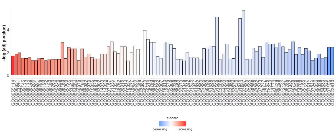
When we first look at the data, we hope to show as many pathways as possible from the graph, and we also hope to find valuable pathways, so we need some parameters to evaluate the importance. Bar charts are often used to describe sample data, so we can use the GOBar function to quickly create a good-looking bar chart.
First, generate a simple bar chart directly, with the horizontal axis beingGO Terms, according to theirzscoreSort the bars; the vertical axis is-log(adj p-value); The color indicateszscore, blue indicatesz-scoreNegative values indicate that gene expression in the corresponding pathway is more likely to decrease, and red indicatesz-scorePositive values indicate that genes in the corresponding pathway are more likely to be elevated. If desired, the order can be changed by setting the parameter order.by.zscore to FALSE, in which case the bars are sorted based on their significance.
- # 生成简单的条形图
- GOBar(subset(circ, category == 'BP'))
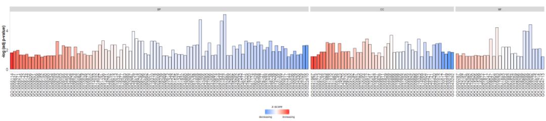
#GOBar(subset(circ, category == 'BP',order.by.zscore=FALSE))Alternatively, change the display parameters to draw a bar graph based on the pathway category.
- #根据通路的类别来绘制条形图
- GOBar(circ, display = 'multiple')
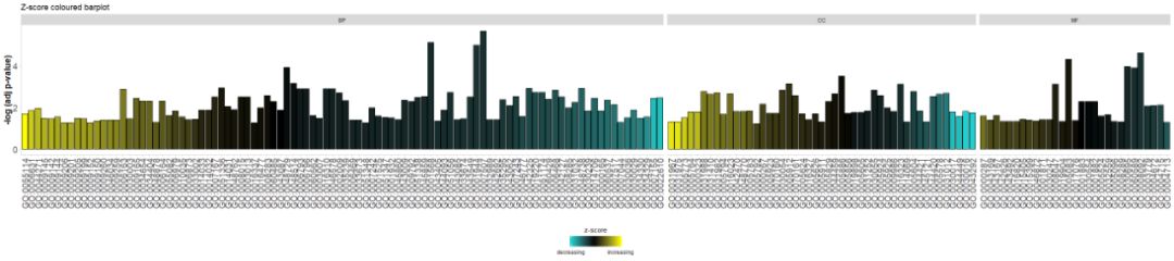
Add a title and use parameterszsc.colChangezscores color.
- # Facet the barplot, add a title and change the colour scale for the z-score
- GOBar(circ, display = 'multiple', title = 'Z-score coloured barplot', zsc.col = c('yellow', 'black', 'cyan'))
Bar charts are very common and easy to understand, but we can use bubble charts to show more information about the data.
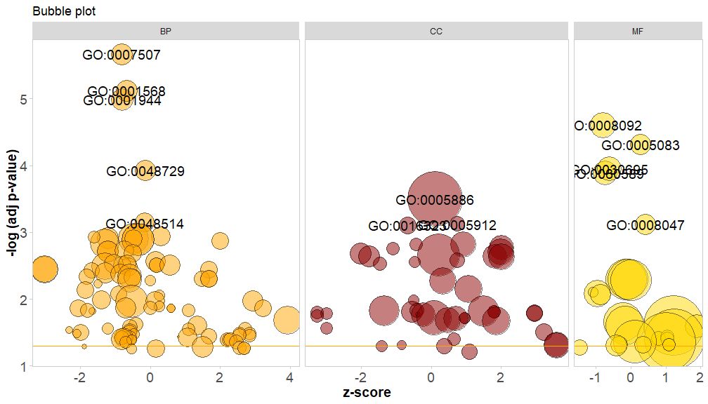
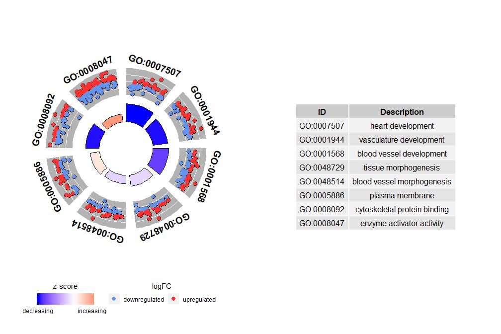
The horizontal axis iszscore; The vertical axis is-log(adj p-value), similar to a bar graph, the higher the value, the more significant the enrichment; the area of the circle is related to the number of genes in the corresponding pathway (circ$count) is proportional to the pathway; the color corresponds to the category of the pathway, green is the biological process, red is the cellular component, and blue is the molecular function.?GOBubbleSee the GOBubble function help page to change all parameters of the image. By default, each circle is labeled with the corresponding GO ID, and a table of GO ID and GO term correspondence is displayed on the right.table.legendforFALSEto hide it. If you want to display the path description, set the parameter ID to FALSE. However, due to limited space and overlapping circles, not all circles are marked, only-log(adj p-value) > 3(Default is 5).
- # 生成泡泡图,并展示-log(adj p-value) > 3 的通路的GO ID
- GOBubble(circ, labels = 3)
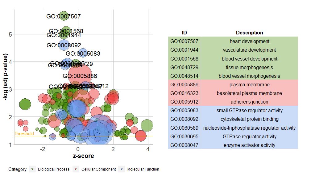
If you want to add a title to the bubble chart, specify the color of the circles, display each category of pathways separately, and change the GO ID threshold for display, you can add the following parameters:
GOBubble(circ, title = 'Bubble plot', colour = c('orange', 'darkred', 'gold'), display = 'multiple', labels = 3)
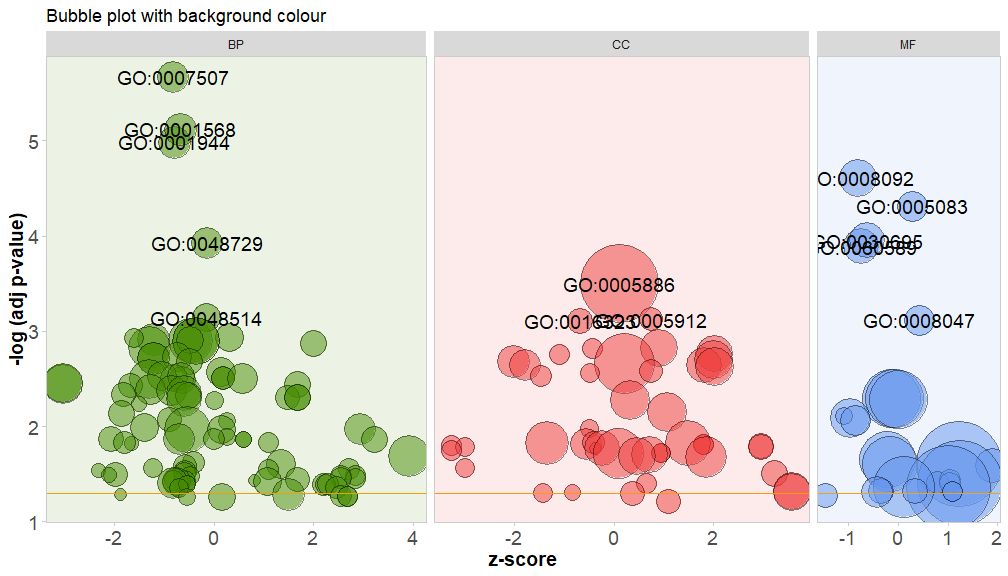
Color the background of the pathway's categories by setting the parameter bg.col to TRUE.
GOBubble(circ, title = 'Bubble plot with background colour', display = 'multiple', bg.col = T, labels = 3)
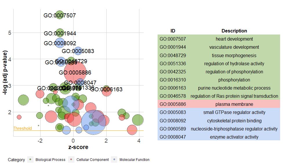
The new version of the package contains a new functionreduce_overlap,This function can reduce the number of redundant items, that is, it can delete all pathways with gene overlap greater than or equal to the set threshold, and only retain one pathway from each group as a representative, regardless of the display of all GO pathways. By reducing the number of redundant items, the readability of the graph (such as the bubble graph) is significantly improved.
- # reduce_overlap,参数设置为0.75
- reduced_circ <- reduce_overlap(circ, overlap = 0.75)
-
- GOBubble(reduced_circ, labels = 2.8)
Although the graph showing all the information helps us find out which pathways are most meaningful, the actual situation still depends on the hypothesis and ideas you want to confirm with the data, and the most important pathway may not be what you are interested in. Therefore, after manually selecting a set of valuable pathways (EC$process), we need a graph to show us more detailed information about this particular group of pathways. However, presenting these graphs leads to a problem: sometimes it is difficult to interpretzscoreAfter all, this calculation method is not universal. As shown above, it is simply the number of up-regulated genes minus the number of down-regulated genes divided by the square root of the number of genes in each pathway.GOCircleThe resulting graph also emphasizes this fact.
The outer circle of the circle plot shows the logFC values of genes in each pathway with scattered points. Red circles indicate up-regulation and blue circles indicate down-regulation. You can use the parameterlfc.colThis also explains why in some cases very important pathways have zscores close to zero. A zscore of zero does not mean that the pathway is not important. It just shows that the zscore is a crude measure, because obviously the zscore also does not take into account the functional level and activation dependencies of individual genes in the biological process.
GOCircle(circ)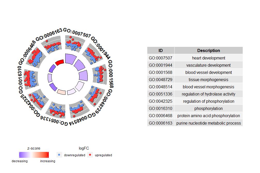
nsubThe argument can be a numeric or character vector. If it is a character vector, it contains the GO ID or pathway to be displayed;
- # 生成特定通路的圈图
- IDs <- c('GO:0007507', 'GO:0001568', 'GO:0001944', 'GO:0048729', 'GO:0048514', 'GO:0005886', 'GO:0008092', 'GO:0008047')
- GOCircle(circ, nsub = IDs)
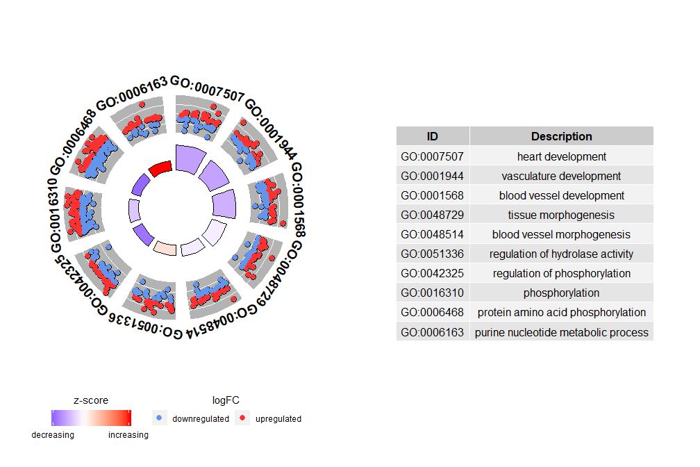
If nsub is a numeric vector, then the number defines the number of channels to display. It starts from the first row of the input data frame. This visualization is suitable only for smaller data. The maximum number of channels defaults to 12. Although the number of channels decreases, the amount of information displayed increases.
- # 圈图展示数据前十个通路
- GOCircle(circ, nsub = 10)
GOChord can show the relationship between the selected genes and pathways and the logFC of the genes. First, you need to input a matrix, which you can build yourself.0-1Matrix, you can also use the functionchord_datThe function has three parameters: data, genes and process, of which the last two parameters must have at least one parameter. Then the functioncircle_datCombine expression data with results from functional analyses.
The bar chart and bubble chart can give you a first impression of the data. Now, we can select some genes and pathways that we think are valuable. Although GOCircle adds a layer to show the expression value of genes in the pathway, it lacks information about the relationship between a single gene and multiple pathways. It is not easy to figure out whether some genes are associated with multiple processes. GOChord makes up for the shortcomings of GOCircle. The generated data rows are genes, and the columns are pathways. "0" means that the gene is not assigned to the pathway, and "1" is the opposite.
- # 找到感兴趣的的基因,这里我们以EC$genes为例
- head(EC$genes)
-
- ## ID logFC
- ## 1 PTK2 -0.6527904
- ## 2 GNA13 0.3711599
- ## 3 LEPR 2.6539788
- ## 4 APOE 0.8698346
- ## 5 CXCR4 -2.5647537
- ## 6 RECK 3.6926860
-
- # 获得感兴趣基因的通路
- EC$process
-
- ## [1] "heart development" "phosphorylation"
- ## [3] "vasculature development" "blood vessel development"
- ## [5] "tissue morphogenesis" "cell adhesion"
- ## [7] "plasma membrane"
-
- # 使用chord_dat构建矩阵
- chord <- chord_dat(circ, EC$genes, EC$process)
- head(chord)
-
- ## heart development phosphorylation vasculature development
- ## PTK2 0 1 1
- ## GNA13 0 0 1
- ## LEPR 0 0 1
- ## APOE 0 0 1
- ## CXCR4 0 0 1
- ## RECK 0 0 1
- ## blood vessel development tissue morphogenesis cell adhesion
- ## PTK2 1 0 0
- ## GNA13 1 0 0
- ## LEPR 1 0 0
- ## APOE 1 0 0
- ## CXCR4 1 0 0
- ## RECK 1 0 0
- ## plasma membrane logFC
- ## PTK2 1 -0.6527904
- ## GNA13 1 0.3711599
- ## LEPR 1 2.6539788
- ## APOE 1 0.8698346
- ## CXCR4 1 -2.5647537
- ## RECK 1 3.6926860
In this example we pass two arguments. If only the genes argument is specified, the result is a list of the selected genes and all process constructs that have at least one of the specified genes.0-1matrix; if onlyprocessparameter, the result is that all genes are generated0-1A matrix of genes assigned to at least one of the processes in the list. Note that specifying only the genes and process parameters may result in a very large 0-1 matrix that can lead to confusing visualizations.

- head(circ)
-
- ## category ID term count genes logFC adj_pval
- ## 1 BP GO:0007507 heart development 54 DLC1 -0.9707875 2.17e-06
- ## 2 BP GO:0007507 heart development 54 NRP2 -1.5153173 2.17e-06
- ## 3 BP GO:0007507 heart development 54 NRP1 -1.1412315 2.17e-06
- ## 4 BP GO:0007507 heart development 54 EDN1 1.3813006 2.17e-06
- ## 5 BP GO:0007507 heart development 54 PDLIM3 -0.8876939 2.17e-06
- ## 6 BP GO:0007507 heart development 54 GJA1 -0.8179480 2.17e-06
- ## zscore
- ## 1 -0.8164966
- ## 2 -0.8164966
- ## 3 -0.8164966
- ## 4 -0.8164966
- ## 5 -0.8164966
- ## 6 -0.8164966
-
- # Generate the matrix with a list of selected genes
- chord_genes <- chord_dat(data = circ, genes = EC$genes)
- head(chord_genes)
-
- ## heart development vasculature development blood vessel development
- ## PTK2 0 1 1
- ## GNA13 0 1 1
- ## LEPR 0 1 1
- ## APOE 0 1 1
- ## CXCR4 0 1 1
This chart is intended to show a smaller subset of high-dimensional data. There are two main parameters that can be adjusted:gene.orderandnlfcThe genes parameter can be specified as 'logFC', 'alphabetical', 'none'. In practice, we usually specify the genes parameter as logFC; the nlfc parameter is one of the most important parameters of this function, because it can handle how each gene has 0 or more logFC values presented in the matrix. Therefore, we should specify the parameter to avoid errors.
For example, if you have a matrix without logFC values, you must setnlfc=0; or if you are performing differential expression analysis on genes under multiple conditions or batches, and each gene contains multiple logFC values, you need to set nlfc=logFC columns. The default value is "1" because it is assumed that most of the time each gene has only one logFC value. Use the space parameter to define the space between the colored rectangles representing logFC. The gene.size parameter specifies the font size of the gene name, and gene.space specifies the space size between gene names.
- chord <- chord_dat(data = circ, genes = EC$genes, process = EC$process)
- GOChord(chord, space = 0.02, gene.order = 'logFC', gene.space = 0.25, gene.size = 5)
-
- ## Warning: Using size for a discrete variable is not advised.
-
- ## Warning: Removed 7 rows containing missing values (geom_point).
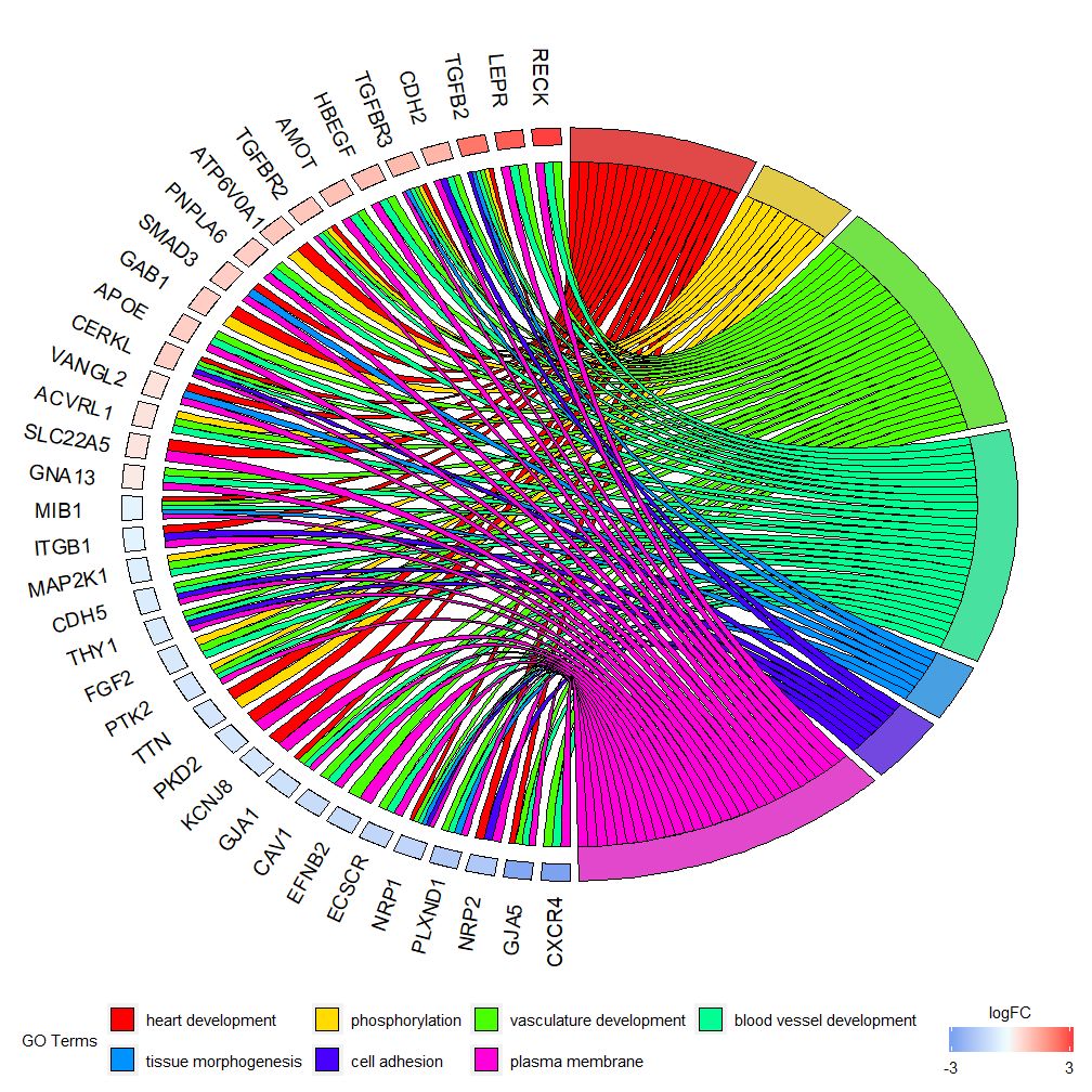
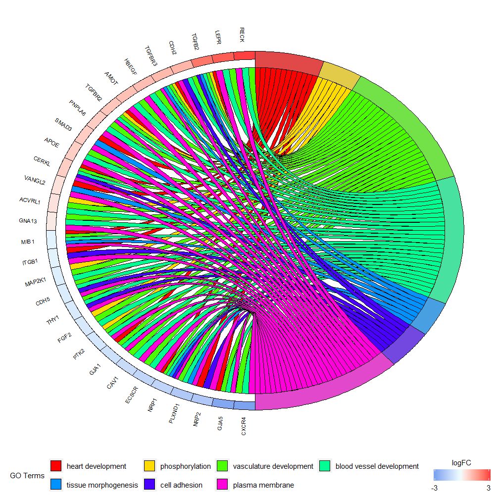
Can be set according to logFC valuegene.order=‘logFC’, sorting genes by logFC value. Sometimes the graph can get a bit crowded, and you can automatically reduce the number of genes or pathways displayed by using the limit parameter. Limit is a vector with two cutoff values (the default value is c(0,0)). The first value specifies the minimum number of pathways a gene must be assigned to. The second value determines the number of genes assigned to a pathway.
- # 仅显示分配给至少三个通路的基因
- GOChord(chord, limit = c(3, 0), gene.order = 'logFC')
-
- ## Warning: Using size for a discrete variable is not advised.
-
- ## Warning: Removed 7 rows containing missing values (geom_point).
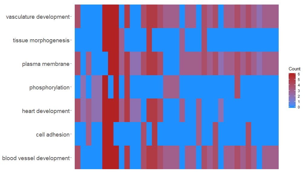
The GOHeat function can use heatmaps to display the relationship between genes and pathways, similar to GOChord. Biological processes are displayed horizontally and genes are displayed vertically. Each column is divided into small rectangles, and the color generally depends on the logFC value. In addition, genes enriched in similar functional pathways are clustered. There are two modes for heatmap color selection, depending on the nlfc parameter. If nlfc = 0, the color is the number of pathways enriched for each gene. See the example for details:
- # First, we use the chord object without logFC column to create the heatmap
- GOHeat(chord[,-8], nlfc = 0)
GOHeat(chord[,-8])In the case of nlfc = 1, the color corresponds to the logFC of the gene
GOHeat(chord, nlfc = 1, fill.col = c('red', 'yellow', 'green'))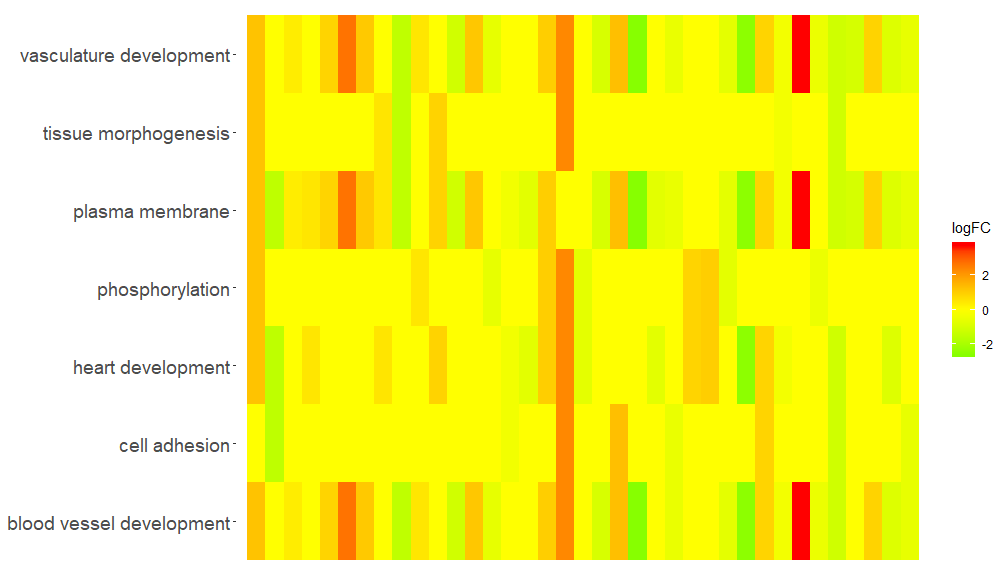
The idea behind the GOCluster function is to display as much information as possible. Here is an example:
- GOCluster(circ, EC$process, clust.by = 'logFC', term.width = 2)
-
- ## Warning: Using size for a discrete variable is not advised.
-
- ## Warning: Removed 7 rows containing missing values (geom_point).
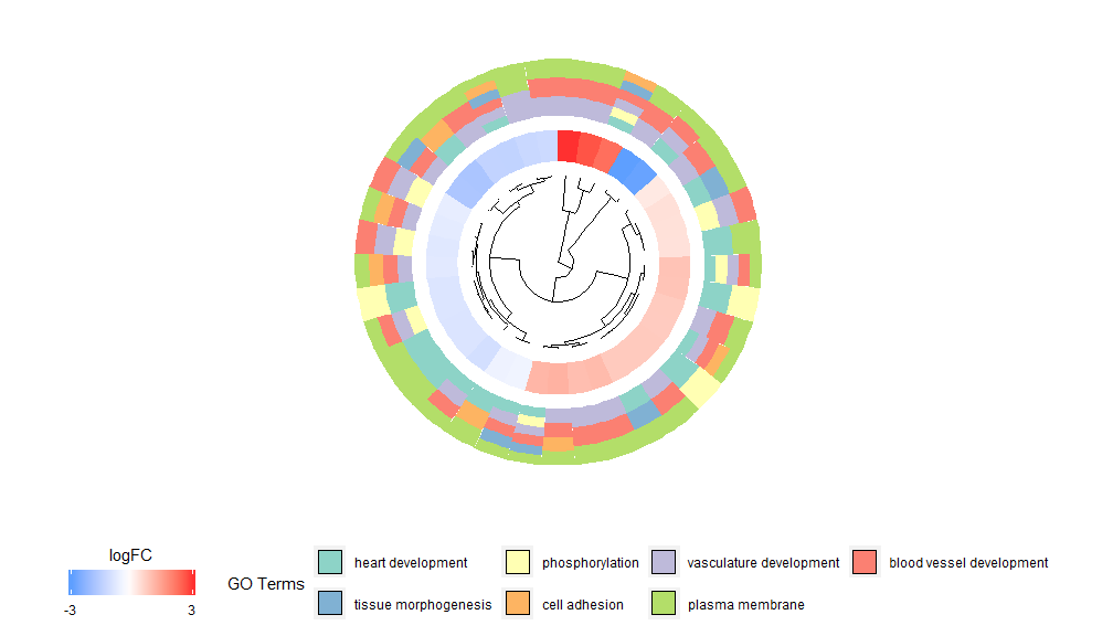
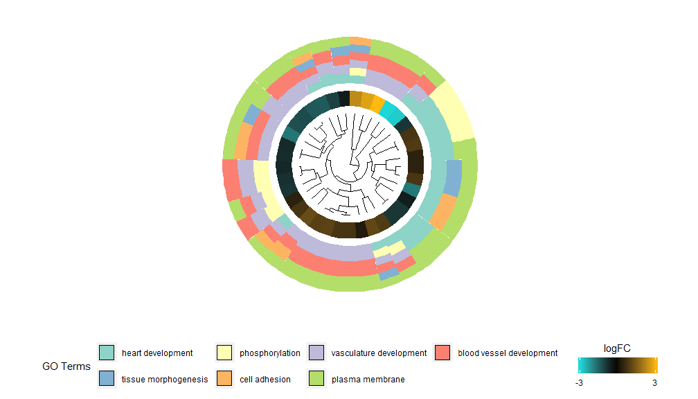
Hierarchical clustering is a popular unsupervised clustering analysis method for gene expression that ensures unbiased grouping of genes by expression pattern, so clusters may contain multiple groups of co-regulated or functionally related genes. GOCluster uses the RhclustThe method performs hierarchical clustering of gene expression profiles. If you want to change the distance metric or the clustering algorithm, use the parameters metric and clust, respectively. The resulting dendrogram can be converted with the help of ggdendro and visualized with ggplot2. A circular layout was chosen because it is not only effective but also visually appealing. The first ring next to the dendrogram represents the logFC of the gene, which is actually the leaf of the clustering tree. If you are interested in multiple contrasts, you can modify the nlfc parameter. By default, it is set to "1", so only one ring is drawn. The logFC values are color-coded using a user-definable color scale (lfc.col); the next ring represents the pathway assigned to the gene. For the sake of appearance, the number of pathways has been reduced. The color of the pathway can be changed using the parameter term.col. It can still be used?GOClusterto see how to change the parameters. The most important parameter of this function is clust.by, which can be used to tell it to cluster by gene expression pattern ('logFC', as shown above) or functional category ('terms').
- GOCluster(circ, EC$process, clust.by = 'term', lfc.col = c('darkgoldenrod1', 'black', 'cyan1'))
-
- ## Warning: Using size for a discrete variable is not advised.
-
- ## Warning: Removed 7 rows containing missing values (geom_point).
Venn diagrams can be used to detect relationships between various differentially expressed gene lists, or to explore the intersection of multiple pathway genes in functional analysis. Venn diagrams not only show the number of overlapping genes, but also information about the gene expression pattern (usually upregulated, usually downregulated, or anti-regulated). Currently, up to three datasets are taken as input. The input data contains at least two columns: one for gene names and one for logFC values.
- l1 <- subset(circ, term == 'heart development', c(genes,logFC))
- l2 <- subset(circ, term == 'plasma membrane', c(genes,logFC))
- l3 <- subset(circ, term == 'tissue morphogenesis', c(genes,logFC))
- GOVenn(l1,l2,l3, label = c('heart development', 'plasma membrane', 'tissue morphogenesis'))
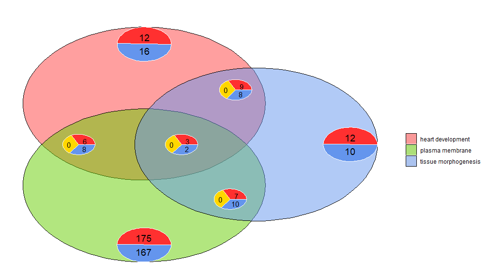
For example, cardiac development and tissue morphogenesis has 22 genes, 12 are upregulated and 10 are downregulated. An important thing to note is that pie charts do not show redundant information. So if you compare three datasets, the genes common to all datasets (the middle pie chart) are not included in the other pie charts. A shinyapp for this tool is available at https://wwalter.shinyapps.io/Venn/. The web tool is more interactive, with circles that are proportional to the number of genes in the dataset, and the pie charts can be moved using a slider. It has all the options of the GOVenn function to change the layout of the plot, and you can also download images and gene lists.
Software homepage: https://wencke.github.io/

I have devoted myself to the research of technology for more than 30 years. I am proficient in various languages such as Java, Linux, JavaScript, PHP, CSS, etc. I have made many contributions in the field of open source. I have established a developer documentation site to share some problems in technology development for everyone to read.